![[Case Study Image Alt Text]](images/design-system/ds-cover.png)
I led the creation and implementation of a design system at Chargefox, aligning cross-functional teams around a shared source of truth. This work standardised design and engineering practices, strengthened product consistency, and laid the foundation for scalable and efficient product development.
Challenges
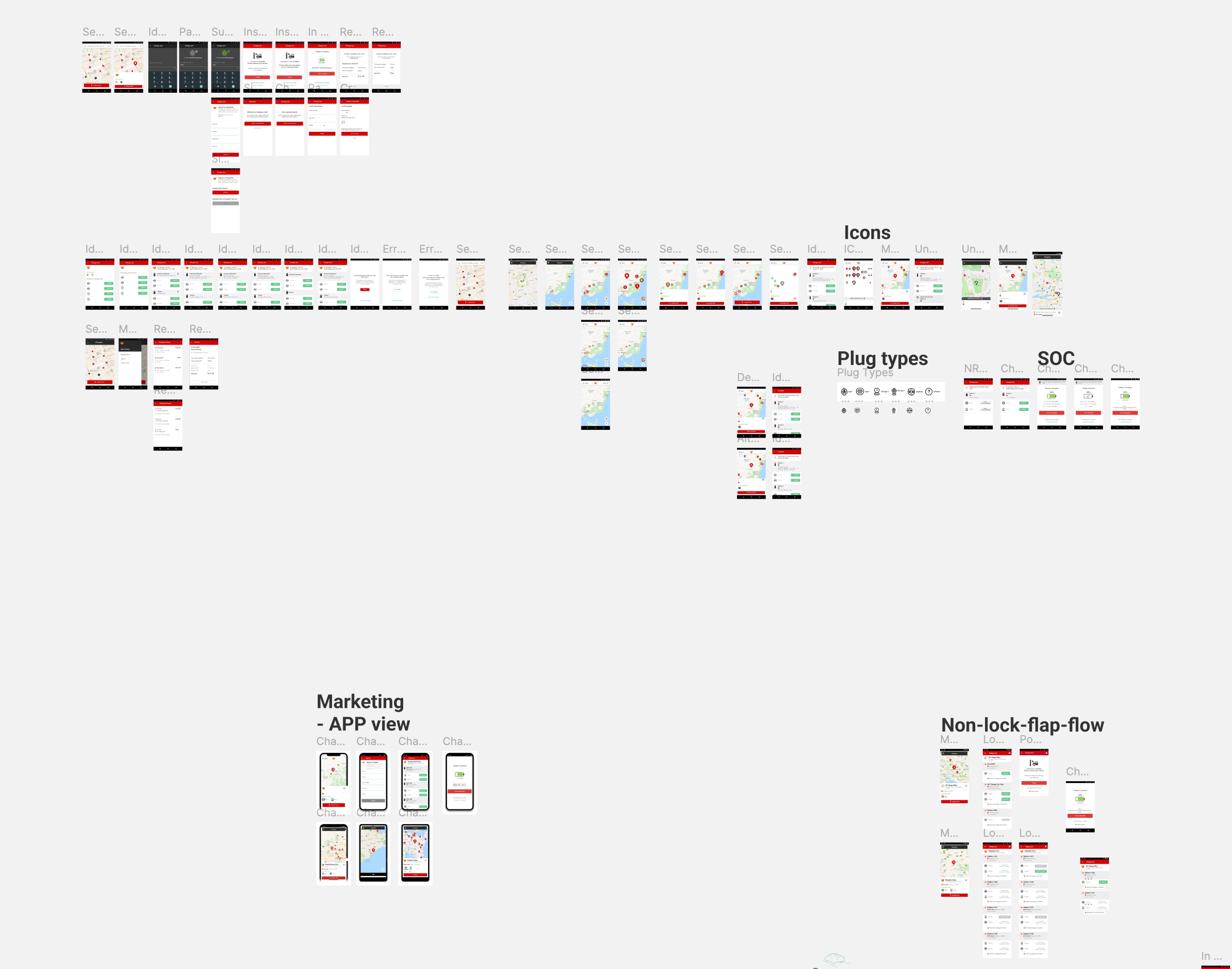
I joined Chargefox during its transition from a start-up to a scale-up, where rapid growth exposed significant challenges. One challenge was the lack of a cohesive design identity, creating fragmented user experiences across the business portal, mobile app, and website.
The reliance on custom-built components further compounded the problem, leading to visual discrepancies and redundant work. As Chargefox scaled, it became evident that the absence of standardised practices and tools hindered our ability to deliver high-quality, unified products in an efficient manner.

Getting started
To address some of the inefficiencies, I conducted an internal survey to understand team pain points and establish benchmarks for collaboration and delivery. This mirrored user research principles I’ve carried into product design roles, focusing on identifying and solving root issues.
I formed a cross-functional design system committee to ensure diverse perspectives and buy-in, with an aim to align on design and engineering quality standards and foundational principles. We focused on core brand elements including:
- Improving and standardised the brand font to enhance readability and consistency
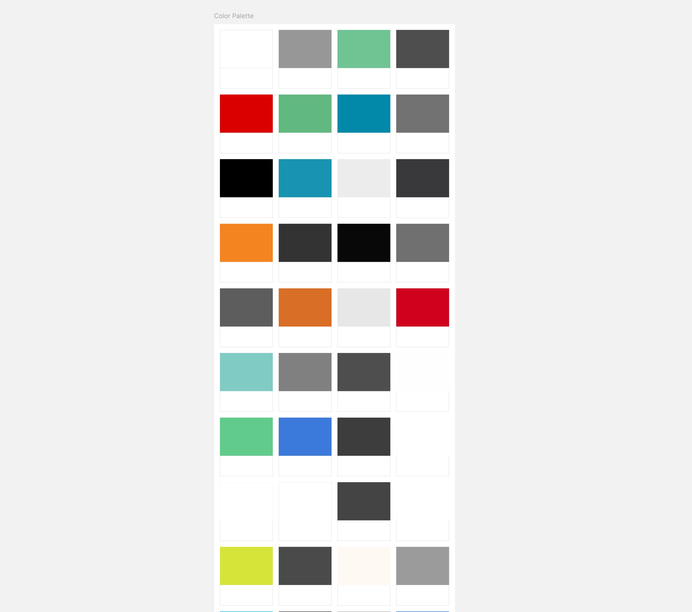
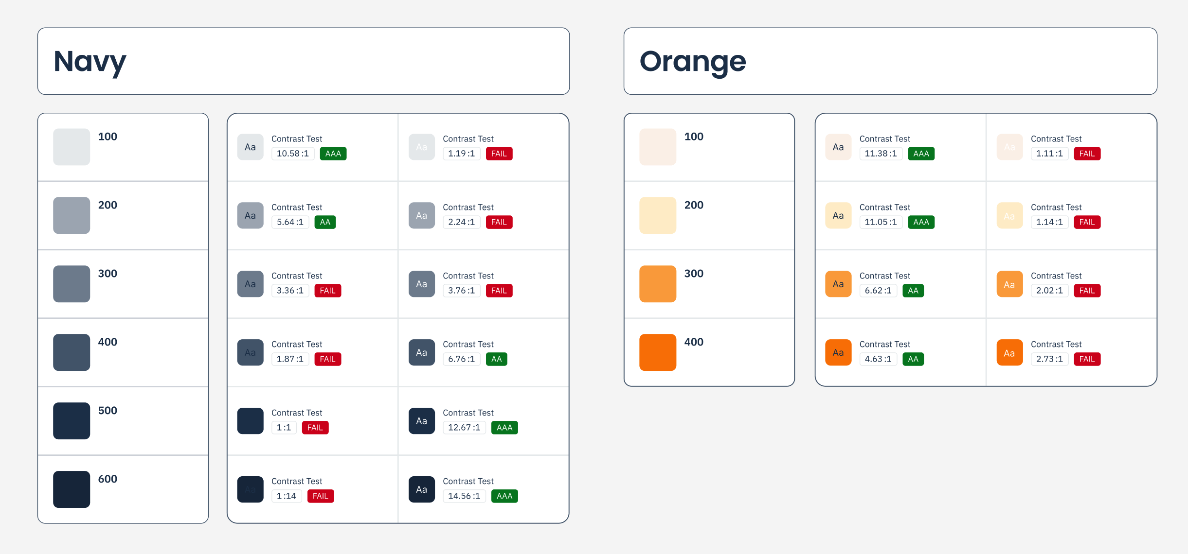
- Streamlining the colour palette, removing outdated and inaccessible options
- Adopting a single iconography set
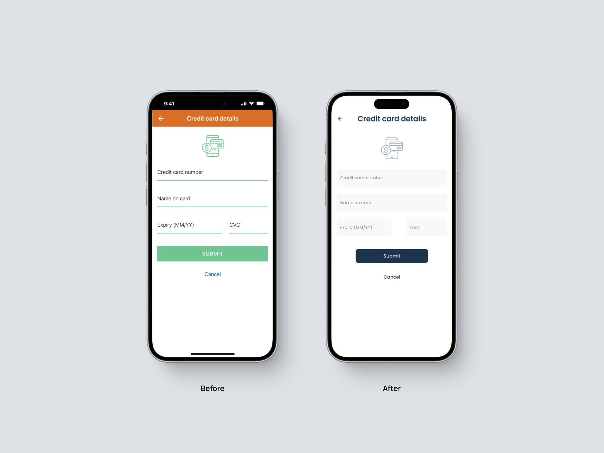
- Defining our brand personality, shaping the tone and the overall look of our products
These decisions formed an anchor for our design system and provided the foundation for scaling consistent, high-quality products across product teams.
Auditing and documenting
We decided the design system rollout wouldn’t involve a complete teardown of our existing products. Instead, a handful of us would work in the background, gradually improving key user touchpoints over time.
The first step was cataloguing all existing web and mobile components to identify inconsistencies and overlaps. I gathered screenshots, old design artefacts, and identified code inconsistencies and outdated libraries.
Building, testing, and rolling out changes
We started with our desktop web portal, knowing changes here carried less risk compared to the mobile app due to volume of traffic. Our focus was on improving consistency for key touchpoints on the web and improving developer processes.
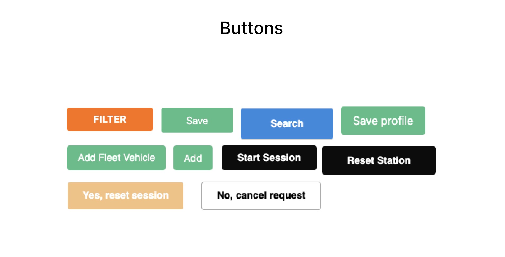
We removed bloat from our codebase like Bulma CSS and Material UI, and replaced components such as buttons, tooltips, links, and text fields with updated designs I created in Figma.

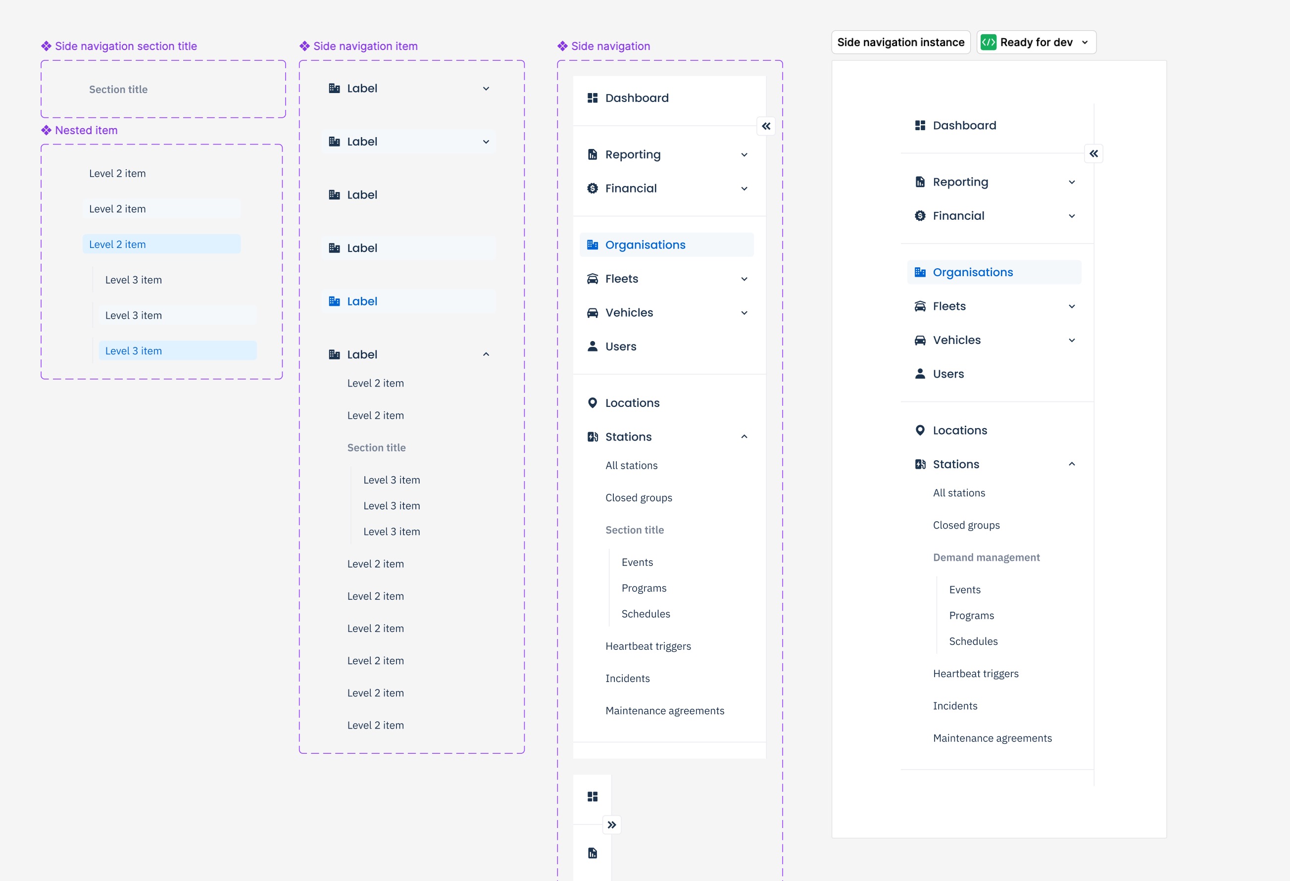
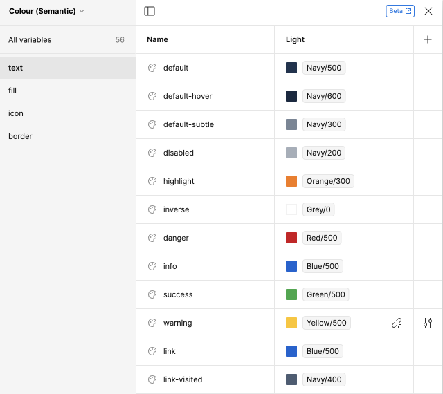
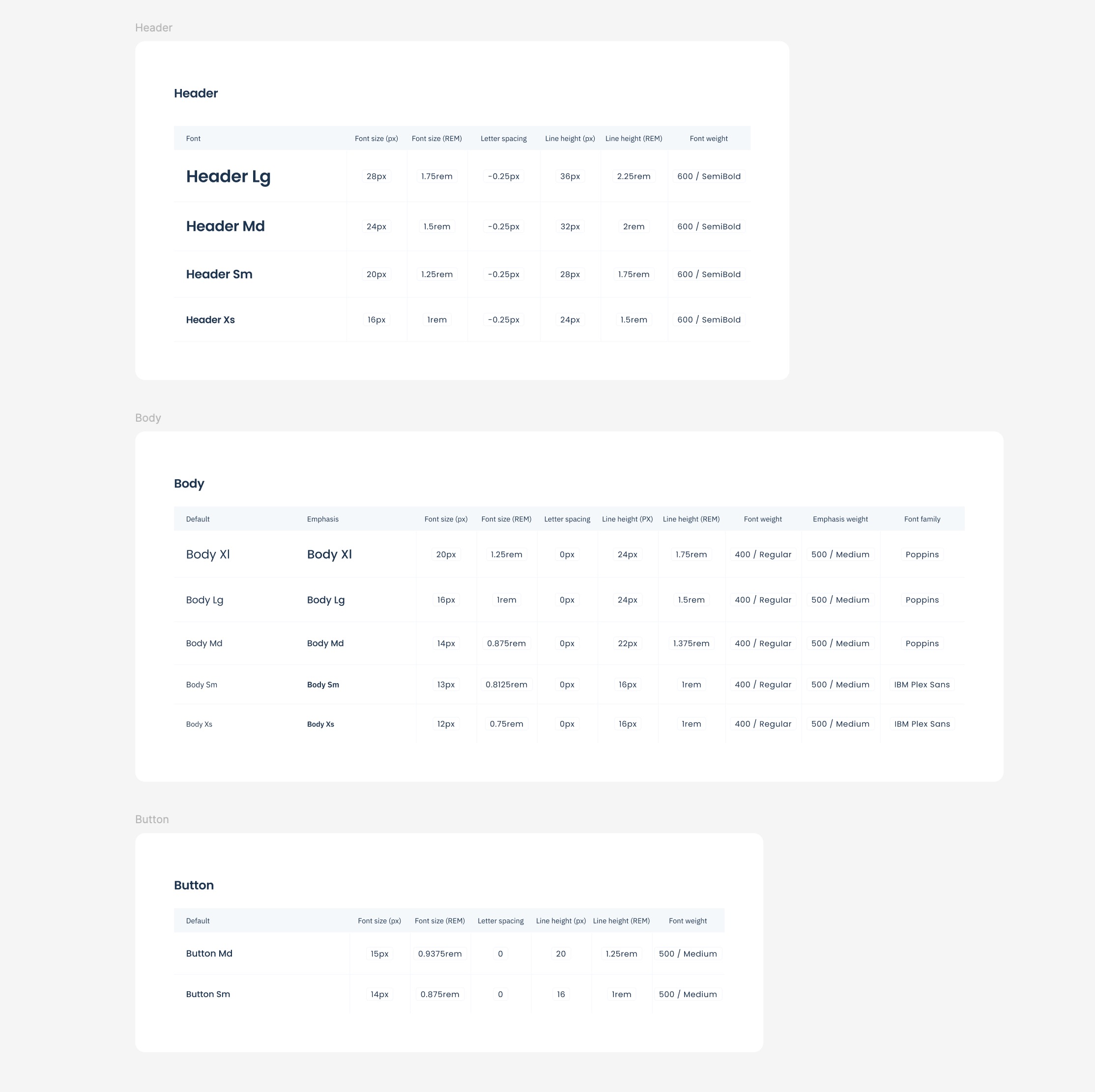
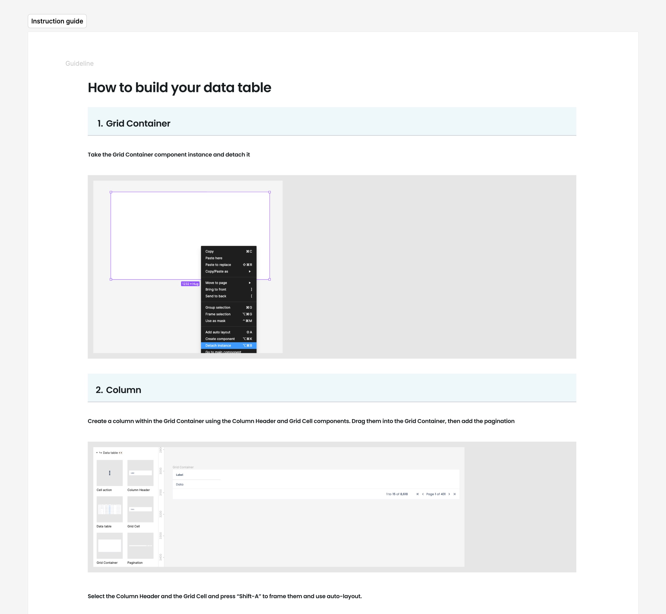
We tested more significant changes like data tables, navigation, and complex forms as product teams implemented them in new features. While this slowed the design system’s progress, it allowed us to align changes with user research and testing results.
Maintaining momentum
Once we had built momentum, new challenges appeared. While teams largely understood how to leverage the design system, gaps in developer resources were causing further confusion and inconsistencies in our product.
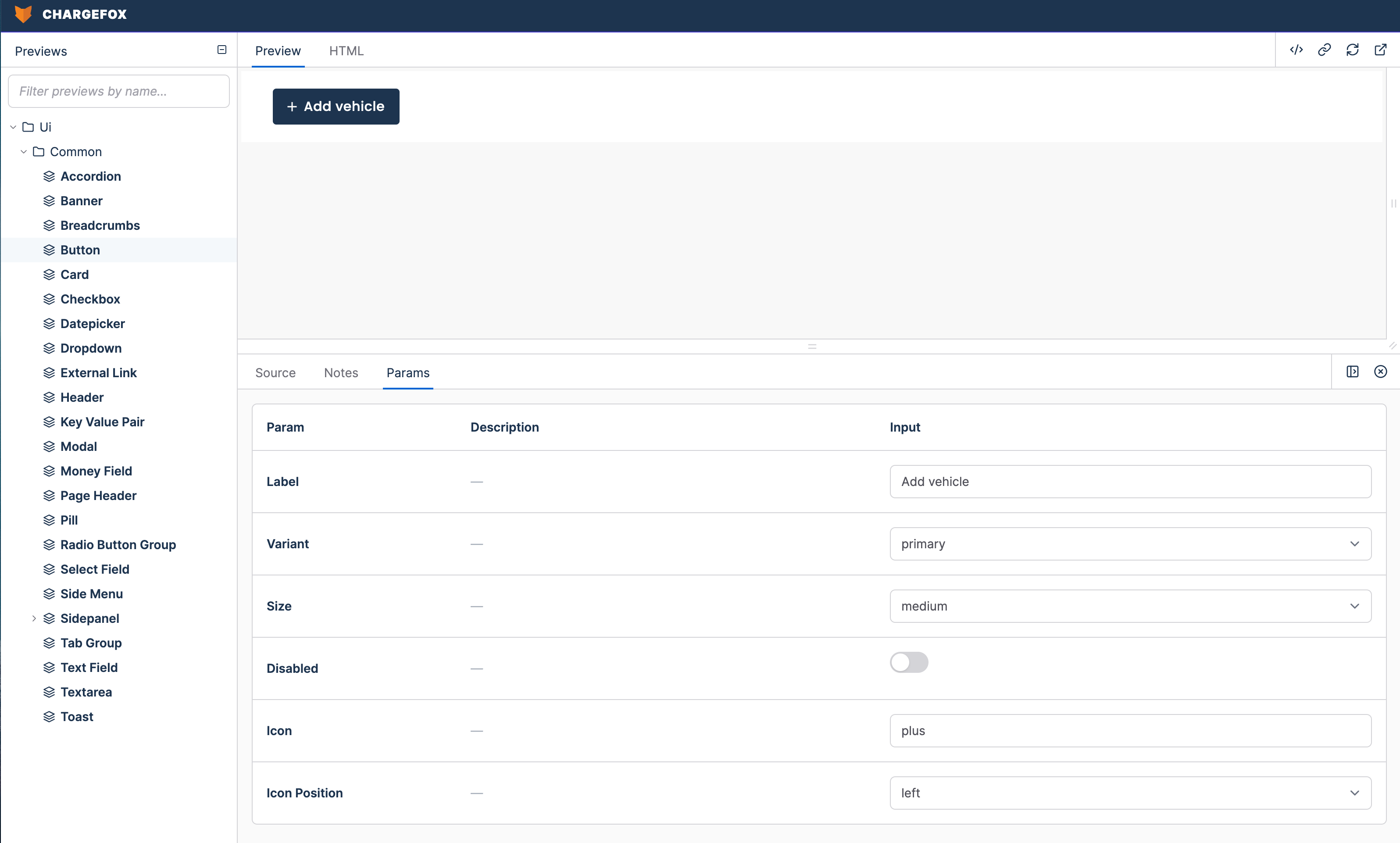
A major pain point was the lack of a live component style guide. Engineers relied on static Figma files, Slack messages, or design system meetings to build components, often guessing how to implement them, which led to bespoke component creation and was beginning to slow down design to developer handover processes.
I paired with engineers and better understood their workflows, which resulted in the introduction of Lookbook, our live component preview tool. This streamlined collaboration by providing real-time updates, interactivity, and a reliable reference for building components.
Impact
The design system significantly reduced time-to-market for new features, improved consistency across platforms, and empowered cross-functional teams to collaborate effectively.
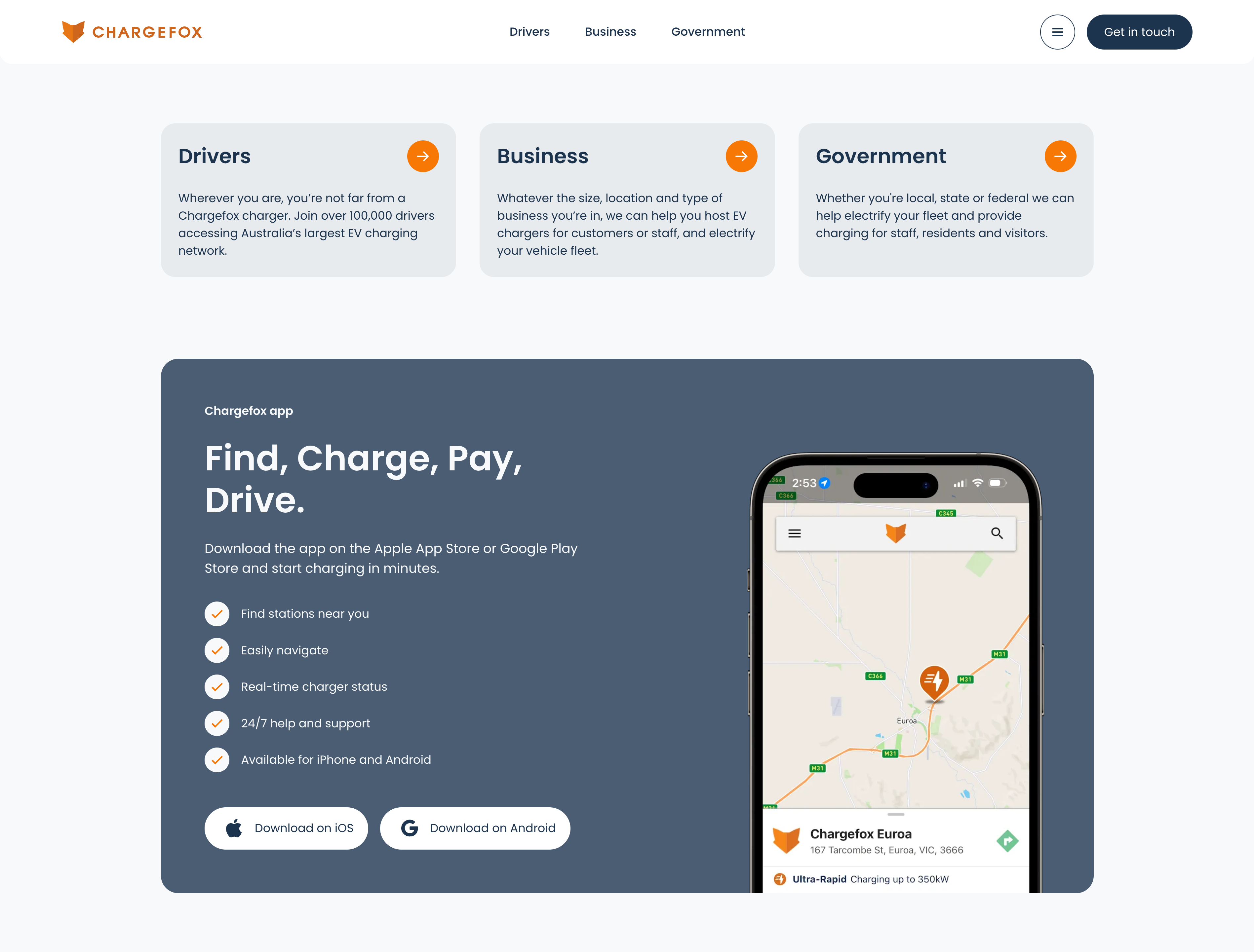
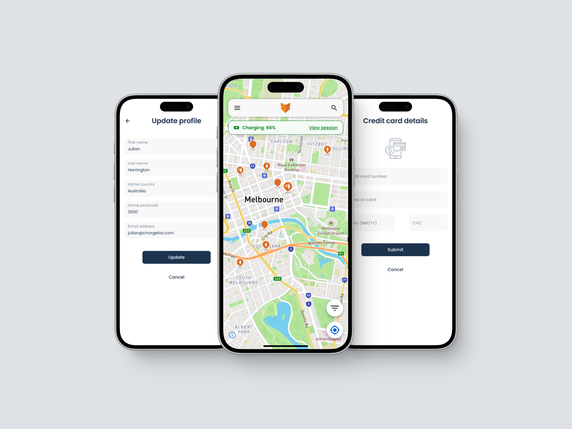
By refreshing our brand and aligning core elements, we created a foundation that enabled rapid scaling while maintaining product integrity.
These outcomes helped transform organisation-wide practices through standardisation frameworks, especially for developers.
Lessons learned
Every design system needs a strong foundation: Conducting internal research, aligning on brand identity, and establishing a clear foundation were essential steps. These created the alignment and clarity needed to drive consistent decision-making and scalable design solutions.
Repetition is key: Regular showcases, team meetings, and designer-developer pairing kept the design system top-of-mind and ensured alignment across teams.
Everyone is a user of your design system: Engaging non-design teams such as marketing, sales, and product management enriched the process, providing diverse perspectives that informed smarter decisions and encouraged broader adoption.
